Colours in your home
When it comes to choosing colours for your home interior, most people rather follow trends and personal taste (preference) with no previous knowledge of the impact certain colours have on people’s moods. We definitely think that walls should be painted, and that is the easiest to change. Even changing colour for only one wall in the room gives the room a totally new look. However, it is very important to know that every colour has a specific meaning and brings certain energy. It is also important not to try to experiment yourself with certain colours and techniques, because after completing the job yourself, you typically will end up calling an expert to fix whatever you tried to accomplish yourself. Here is how the experts see colours in our home.
Bedroom, our relaxation and quiet oasis. The room atmosphere needs to be calming (soothing) and relaxing. For peaceful dreams it is recommended to use pastel colours that are often found in nature. Most often these are shades of blue, resembling calming waves or green grass, or yellow ocher colour, resembling falling leaves in autumn.
Living room, that’s the place in our home where we spend most of our time. For that reason, this room should be dominated by vivid and energetic colours. Both room size and ceiling height are very important features. If the room is small in size, it is not recommended to paint all the walls in dark colours; however you should play with one wall and experiment with its colour.
Dining room is the place where details make a big difference. It is important to know that the colour red boosts your appetite while the colour blue does the opposite. The choice is yours.
Kitchen is our creative space. Therefore, here you should experiment with different colour shades as long as they inspire you. Our only advice is to use washable colours here.
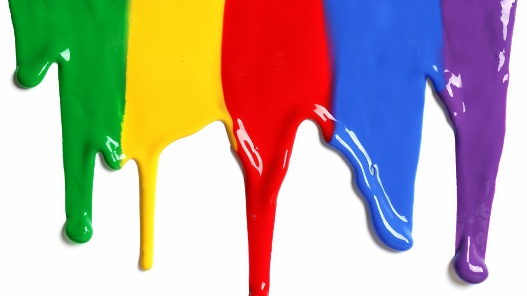
And now a little bit about colours and their meanings.
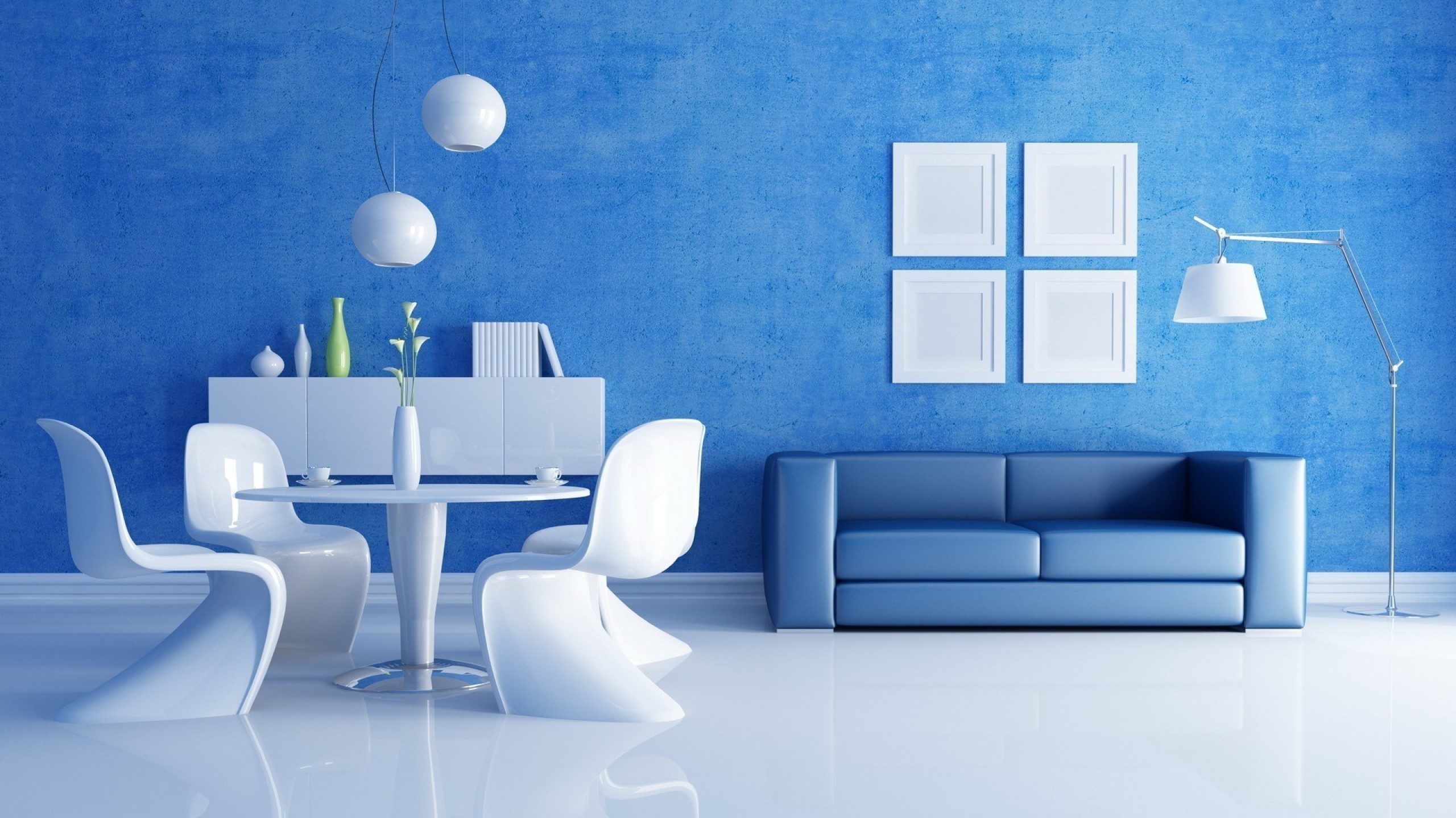 THE COLOUR BLUE
Blue is considered a cold colour. Blue is recommended for south-facing rooms, the rooms exposed to natural sunlight. Picking the right shade of blue is very important. Blue can be combined with warmer colours in order to bring more warmth to your home by this contrast. You can also experiment with a colour of your floor and the colour blue goes well with a dark hardwood floor. Small decorations in the room should have lighter colours compared to the walls.
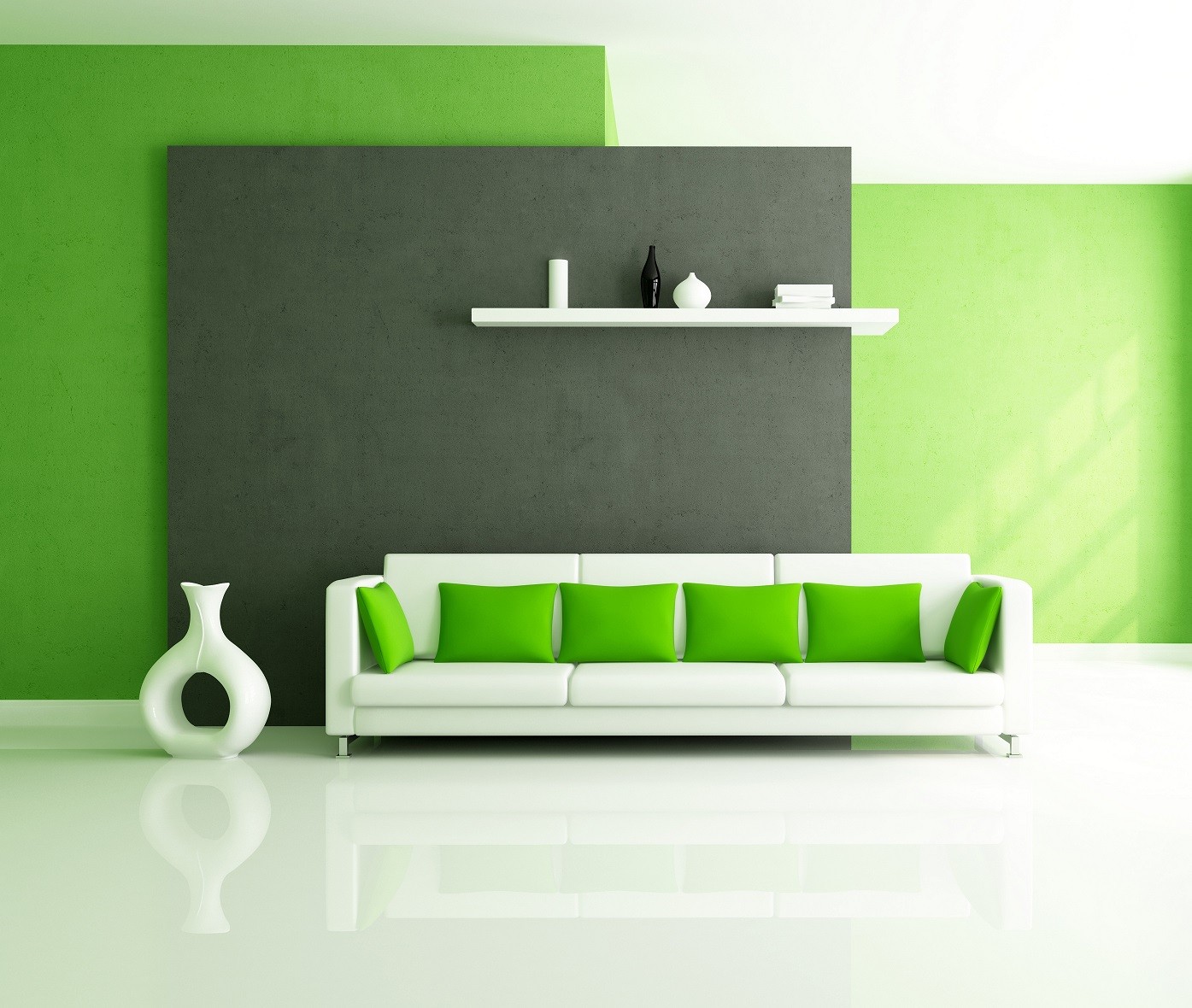
THE COLOUR GREEN
Green is also recommended for south-facing rooms. Something specific for the colour green is that it is most often selected when people are unsure about what colour to coat their home in. Green goes well with all the colours of nature and natural materials. There is a big chance that your existing hardwood floor and your wooden furniture will fit well with green.
 THE COLUR RED
Red is the colour of fire and is one of the warmest colours. Also, red is a very complex colour. Red stimulates appetite thus it is often used in dining rooms. You should also try it in your home office but moderately. You can use red to accentuate the feature wall in your room while balancing its brightness by having details with more soothing colours.
 THE COLUR YELLOW
Yellow is the colour of the Sun. This colour brings energy. Yellow is recommended for north-facing rooms because it brings warmth. The colour yellow needs to be offset by other colour that will bring more balance in the room. For other colour, you should either choose more soothing tone or contrasting colour from a cold part of the spectrum. The colour ivory goes well with yellow.
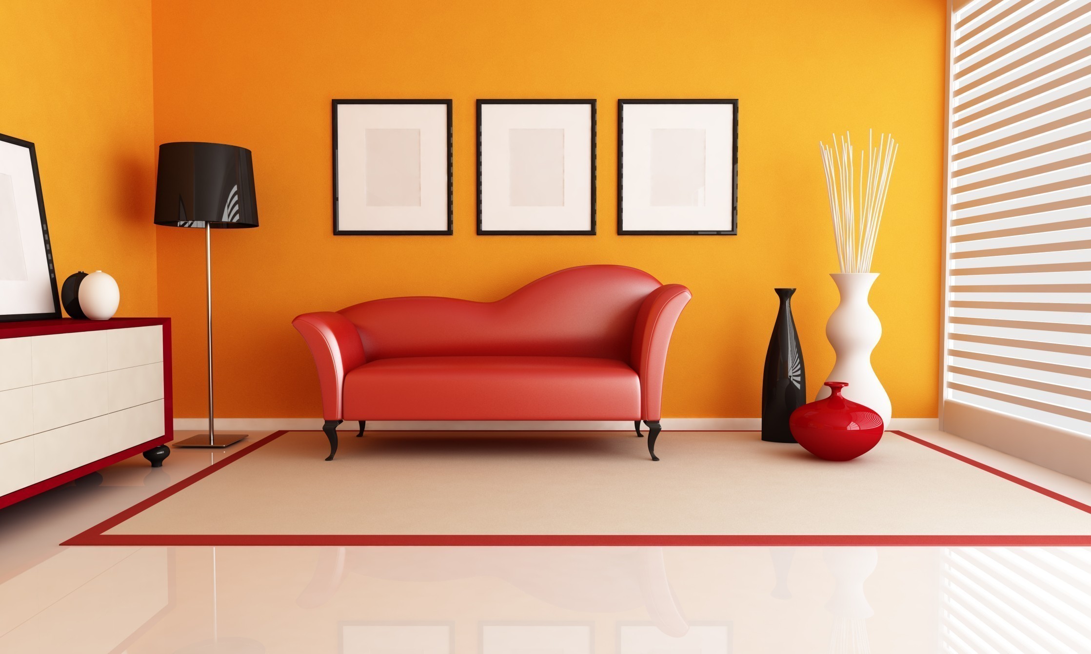 THE COLUR ORANGE
Like the colour yellow, orange also brings energy into the room. Orange requires rich texture. To get the most out of it, it is highly recommended to use orange as accent colour. This colour shouldn’t be the only colour on a smooth wall. Orange should be your choice for the room in which you would like to be more creative. Your home office or kitchen can get more energetic tone. Keep in mind that the colour orange goes well with dark wood furniture and dark hardwood floors. Light coloured wood will not provide enough contrast.
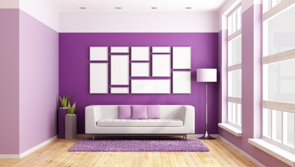 THE COLOUR OF PURPLE
Purple is “two-faced” colour since it’s created by mixing a warm red with a cold blue. One moment, purple is sophisticated and gentle and the next, it is a cold queen among colours. For a long time, purple was associated with royal symbols (crown jewels) and this colour still represents the colour of luxury and glamour. Purple is the colour of success. Purple with more red in it feels warmer while purple with more blue appears colder. With purple, one has a choice from a wide variety of furniture colours, from lighter beige to darker tones.
Regardless what colours you choose remember that ceilings need to stay white to avoid a trapped-in-a-box effect. Also, if you are not sure what colour is right for you, avoid painting all the walls. Choose one wall to be your canvas. Pick a colour that matches your taste and sensibility, you only live once. It’s only wall, it can be fixed. That’s why we are here.

